Turned Ria’s signup dead ends into recoveries
10.4%
Increase in conversion
17%
Faster completion time
Background
Ria is an international money transfer platform. Most of its users are immigrants sending money to family back home. I came into this project to migrate the signup flow to our new design system, but as I audited the existing flow, I realized that simply swapping components alone would just carry old problems into a new shell.
My role
I led the redesign from diagnosis through shipping. I scoped problems with my PM, prioritized what to tackle given tight resources, prototyped with Claude Code to test on-device, and partnered with engineers through the build. Beyond that, I introduced a Design QA step alongside functional QA to make sure interaction details made it into production intact.
Team
1 Product Designer (me)
1 Product Manager
2 Software Engineers
Duration
Oct 2025 - Nov 2025
*First launched in Portugal on Nov 20, 2025. Rolling out country by country.
Tools
Figma
Claude Code, Cursor
Amplitude, LogRocket
( Problem )
Low-resilience flows that break under real user behavior
Users had to remember. The system couldn’t help
Our security model requires users to log in frequently. When returning users mistakenly try to sign up again, the system simply shows “Email is already taken,” leaving them to manually navigate back and find the correct path on their own. Each month, 69K users hit this dead end, and 40% drop off after encountering the error.

Real-world scenarios weren’t accounted for
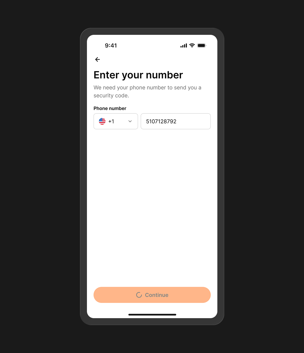
Many of our users are cross-border immigrants, so registering with a home-country phone number is common. However, OTP verification relied entirely on international SMS delivery, where failure rates reached 80.1% for these numbers. When users didn’t receive a code, there was no fallback and no way to continue.

Our goal was to build resilience into the flow so it could meet users where they actually are.
( Design solutions )
01
Dead end → Recovery path
Before
69K users hit a dead end each month and had to navigate back manually. 40% dropped off entirely.

After
I introduced a direct path to login, turning a blocking error into a recoverable step.

( Trade-off )
Ideally, the system would recognize returning users and route them automatically, preventing the error altogether.
However, this would require changes to the backend structure and impact the overall flow architecture. Given the scope and available resources, we prioritized a quicker fix to address the immediate drop-off, with plans to revisit and redesign a merged signup and login flow later.

02
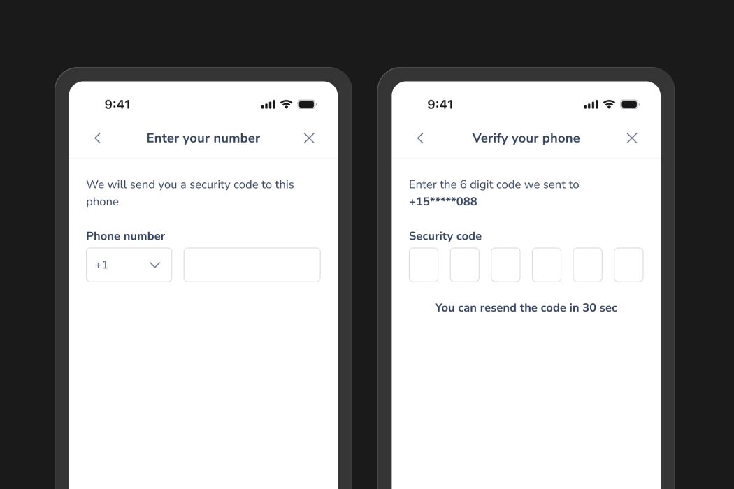
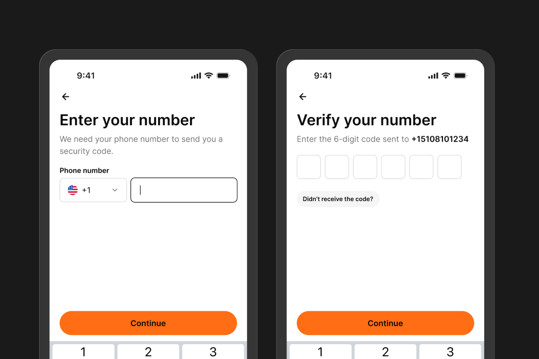
No fallback → Progressive recovery
Before
When OTP delivery failed, users could only retry via SMS or phone call. Both relied on international carriers. For users registering with a home-country number while abroad, this often became a dead end.

After
I designed a progressive recovery flow that escalates based on user behavior:
• 1st nudge: after one SMS resend and no input for 30s, a modal prompts users to try a different method.
• 2nd nudge: after two resend attempts, an inline alert surfaces the option to contact support.

( Design decision 01 )
Why two stages, not one?
We want to prevent users from abandoning the flow when an alternative might just work. Plus, always sending users to customer support might put unnecessary load on the support team. That’s why we let users try first, and bring in support when self-service can’t get them through.
Previous version

( Design decision 02 )
Why different forms for each nudge?
I initially tried using the same format for both, but realized these moments serve different goals. The first nudge needs to recapture attention and drive action, so a modal is effective. However, contacting support is a high-commitment action. We didn’t want to force that decision, so I changed it to a less intrusive alert instead.


( Trade-off )
Ideally, we’d fix the delivery, not just add a fallback.
We’re exploring WhatsApp as a more resilient alternative, since it bypasses carrier limitations through Wi-Fi. However, this requires backend and partnership work, so we scoped it as a longer-term solution.


03
The rest of the polish
Before
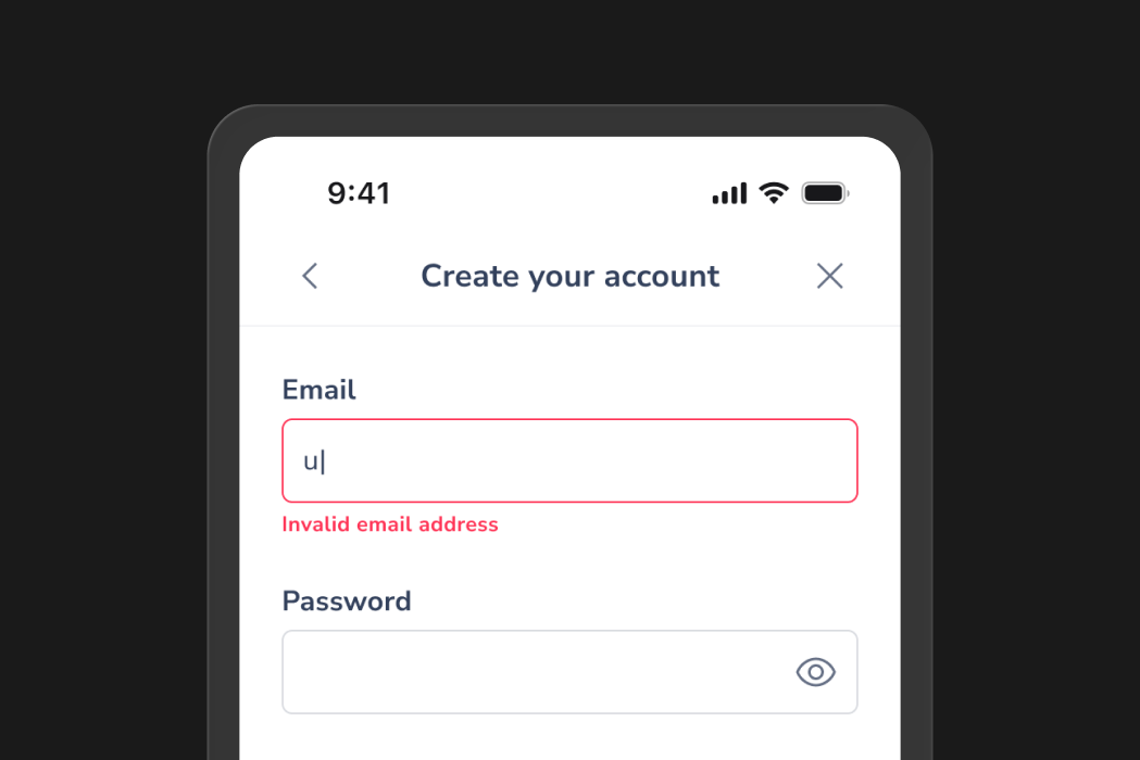
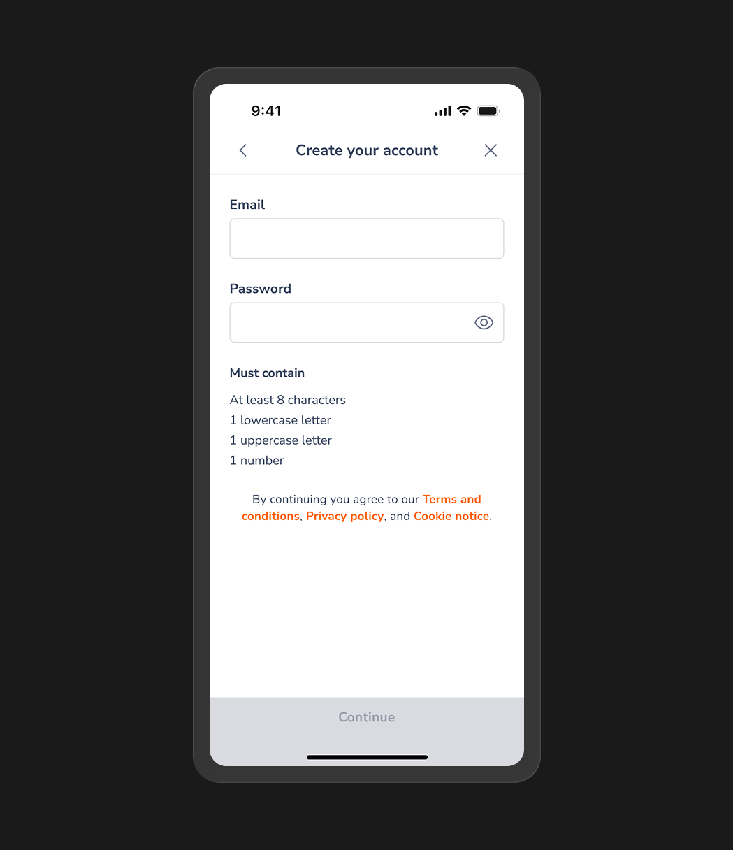
Validation triggered on the first keystroke, showing errors before a user had finished typing. Seeing errors when nothing is wrong makes the app feel unreliable.
After
I moved validation to trigger only after a user exits a field or taps Continue, so errors appear when there’s actually something to correct.
Before
Every element carried the same weight, so nothing signaled what the page was for or what to do next.
After
I rebalanced the hierarchy so users can immediately see what the page is about and what action to take.
Before
A full-screen loader blocked every transition (even instant ones), making the product feel slow and heavy.
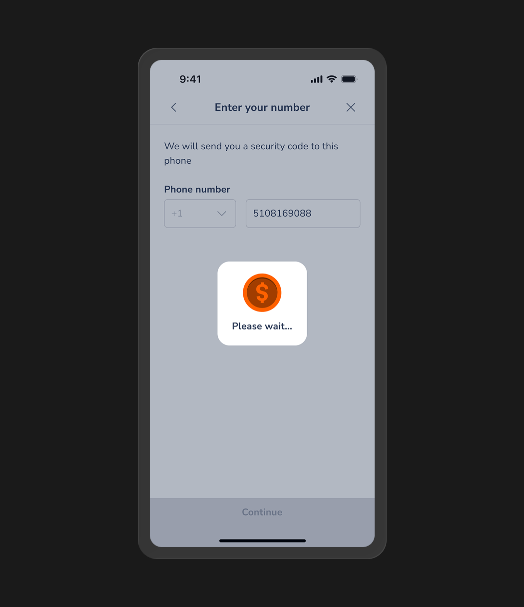
After
I moved the loading state to the button itself, so transitions feel smooth and uninterrupted.
Before
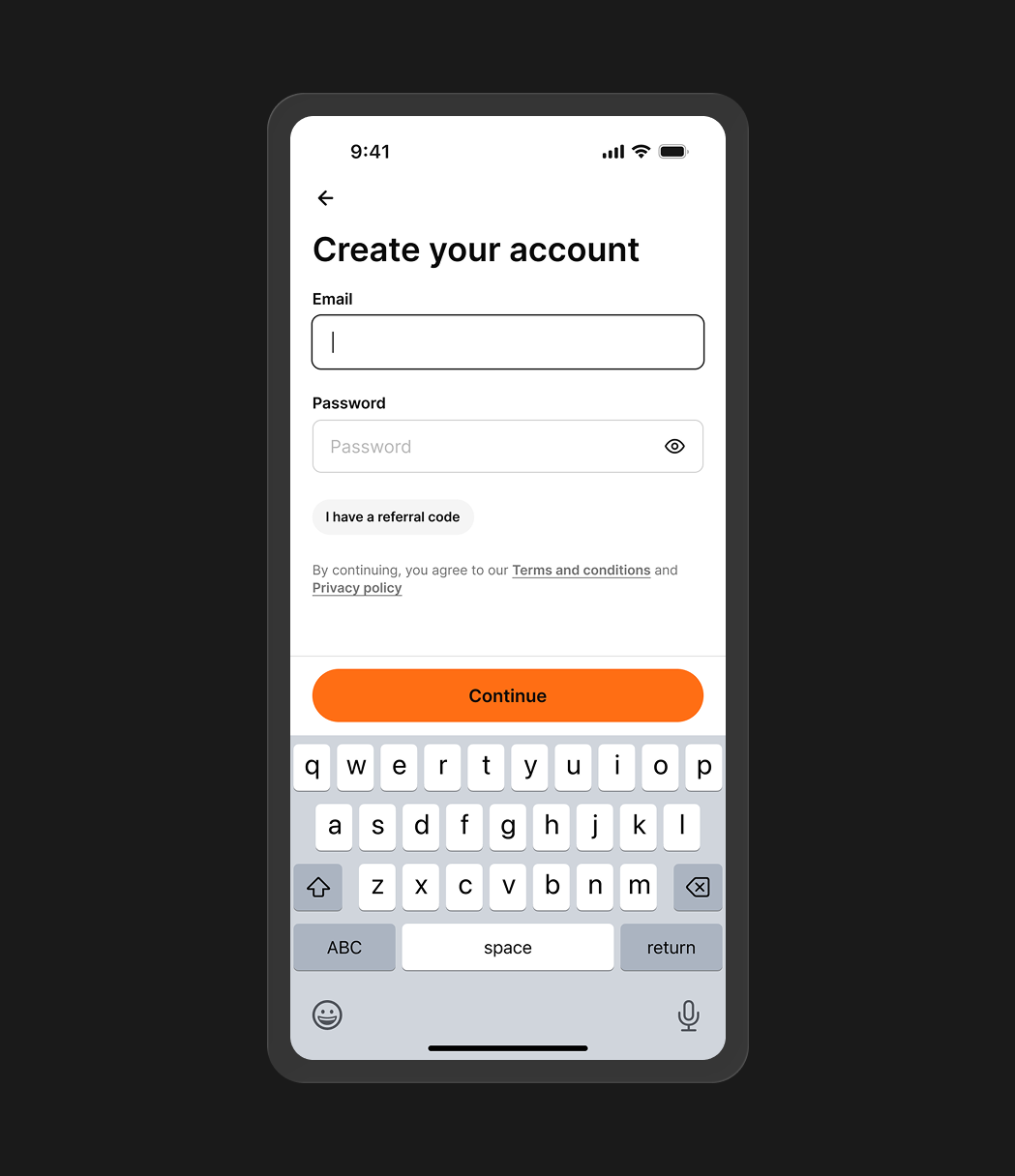
Inputs sat at the top while CTAs and the keyboard sat at the bottom, forcing unnecessary thumb movement.
After
I set the keyboard to auto-focus on page load, so users can start typing right away.
03
The rest of the polish
Before
Validation triggered on the first keystroke, showing errors before a user had finished typing. Seeing errors when nothing is wrong makes the app feel unreliable.
After
I moved validation to trigger only after a user exits a field or taps Continue, so errors appear when there’s actually something to correct.
Before
Every element carried the same weight, so nothing signaled what the page was for or what to do next.
After
I rebalanced the hierarchy so users can immediately see what the page is about and what action to take.
Before
A full-screen loader blocked every transition (even instant ones), making the product feel slow and heavy.
After
I moved the loading state to the button itself, so transitions feel smooth and uninterrupted.
Before
Inputs sat at the top while CTAs and the keyboard sat at the bottom, forcing unnecessary thumb movement.
After
I set the keyboard to auto-focus on page load, so users can start typing right away.
Impact
10.4%
Increase in conversion
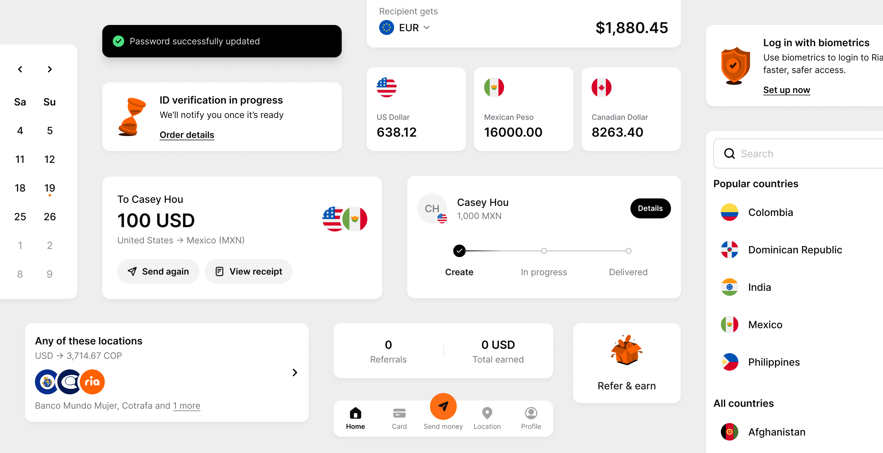
Signup conversion increased from 49.1% to 54.2% (+5.1pp) in the three months since launching in Portugal (Nov 2025), measured through a 50/50 rollout.
17%
Faster completion time
Median completion time dropped from 2m 32s to 2m 6s over the same period.
Beyond the flow itself
I introduced Design QA beyond my team
Before this project, Ria only had Functional QA. Design intent was often lost in production. I introduced a Design QA step alongside Functional QA to close that gap, starting with this signup flow. It was later adopted by multiple teams after I shared the results internally.
I turned scattered logic into a single source of truth
Signup logic was spread across the codebase and Figma files, with no single place to understand how the flow worked. I worked with engineers and PMs to map validation rules in one place, so the team could see how the flow and its logic connect end to end.
( Diagnosis )
A hands-on audit caught 7 interaction issues. Data analysis uncovered 2 major drop-off points.

I went through the full signup flow to experience it the way a user would and identify where confidence started to drop. I tested on both iOS and Android (since interactions can differ between platforms), flagging issues in FigJam along the way.

To find where users were actually leaving, I worked with my PM to dig into Amplitude funnels and LogRocket sessions. Our dev team also helped verify API-level data so we could trace the root causes behind certain drop-offs.
I grouped these issues into two layers based on how they affected the user journey.
Surface friction
Issues that affect the polish and feel, but don’t break the journey.

Issue 1
Full-screen loaders between every step caused flickering, making the product feel slow and heavy.
Issue 2
Inputs were at the top while CTAs and the keyboard sat at the bottom of the screen, forcing excessive thumb movement.
Issue 3
Error messages appeared before users finished typing, making the experience feel error-prone.
Issue 4
Buttons shifted height when the keyboard appeared, making it feel like something was broken.
Issue 5
Visuals were outdated and misaligned with our brand. This inconsistency undermined trust.
Issue 6
Visual hierarchy was off. All elements carried the same weight, so nothing stood out.
Issue 7
At the phone number step, the country code field looked disabled but was actually active, confusing users about whether they could change it.
→ These were clear, fixable issues, so I moved straight into prototyping and refinement to validate interaction details before handoff.
Breaking Points
Failure points where system logic forces users out of the flow.
Issue 8
69K users per month hit “email is already taken” with no path forward.
Issue 9
14.7% drop-off at OTP verification, driven by an 80.1% international SMS failure rate among diaspora users.
→ I focused my design effort here because these are the moments that directly cost us users.
With the problems clear, I started exploring solutions for both layers.

( Prioritization )
We couldn’t fix everything, so we picked what mattered most.
This project’s original scope was just replacing old components with ones from the new design system. But with tight resources, I worked closely with my PM to evaluate solutions on impact and effort. Surface friction could ship alongside the migration. Bigger changes like WhatsApp verification and merging signup with login needed backend work and cross-team coordination, so we scoped them into the roadmap.

( AI prototyping )
I prototyped on-device to catch what static mockups can’t.
A large part of the friction I identified came from interaction details such as transitions, timing, and keyboard behavior. To evaluate them in context, I used Claude Code to build a working prototype in Expo and tested it on my phone with the team.
This helped me confirm that the interactions worked as intended in real conditions and served as a shared reference during handoff.

I built a working prototype in Expo to test and demo the flow.
What I learned
•
Recovery matters as much as the happy path
Working on this flow made me realize how important it is to design for recovery, especially for a cross-border product like Ria. Our users operate in very different contexts, and many factors are simply out of our control, like international SMS delivery. I now put as much effort into designing how the system responds when things go wrong as I do into the happy path.
•
Interaction details drive real impact
I used to think of transitions, timing, and edge states as small details. But working through this project, I saw firsthand how much they shape the overall experience, whether it feels smooth, complete, and trustworthy. I also saw how even small adjustments can lead to measurable improvements in conversion and completion time.