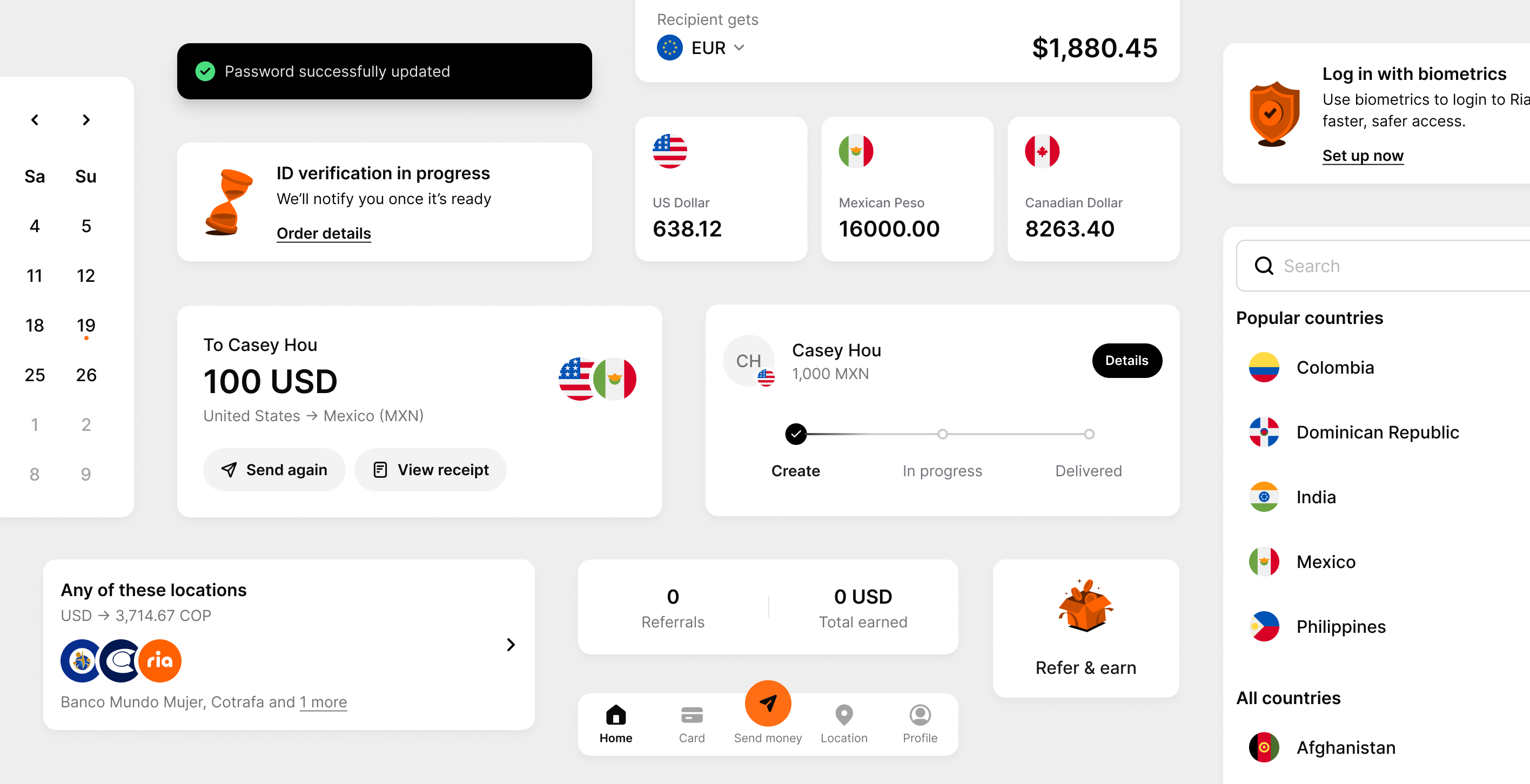
Ria Money Transfer
Rebuilt authentication
around recognition
Context
Ria is a global platform that helps people send money internationally. Every month, around 69K users forget they already have an account and hit “Account already exists” during signup. They then have to find their way back to login. Recovery takes over three minutes on average, and 35% of users give up. Because authentication is required every time users open the app, what seems like a one time friction becomes a problem at scale.
My role
I led the redesign from diagnosis through launch. I defined the authentication architecture across signup, login, returning users, international variants, edge cases, and error states. I also built interactive prototypes in Claude Code to validate the experience and partnered closely with engineers through implementation.
Result
Rolling out in the U.S. starting June 2026, expanding globally.
Team
1 Product Designer (me)
1 Product Manager
2 Product Engineers
Duration
Mar 2026 - May 2026
Tools
Figma
Claude Code, Cursor
Expo, Simulator
Device
iOS, Android, Web

Problem
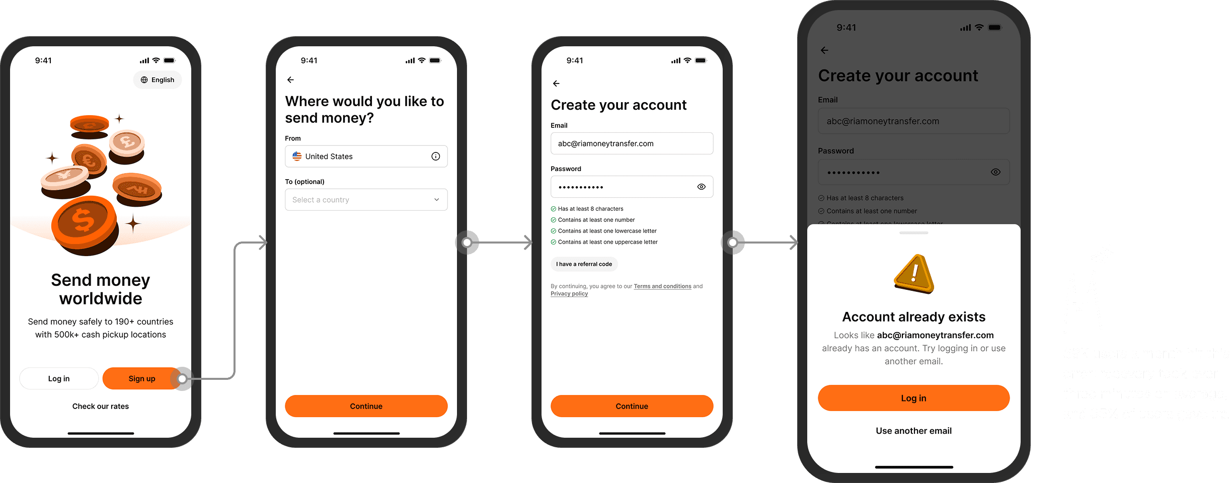
Every month, about 69K returning users took a wrong turn into signup.
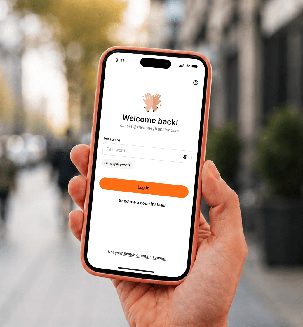
These users didn’t remember they already had an account. They might have registered on the website, signed up at one of our physical stores, or returned on an unremembered device.
The error wasn’t a dead end, but the detour was costly enough that recovery took over three minutes on average, and 35% of users gave up before completing the process.
Why it mattered
For security, users need to log in every time they use Ria. That frequency is what turned this problem from a one-off friction into a problem at scale.
Design direction
The scale of the problem shifted our focus from recovery to prevention.
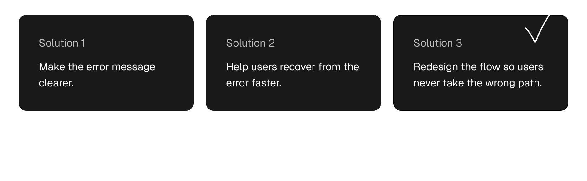
To address the problem, we considered three approaches: make the error message clearer, help users recover faster, or redesign the flow so they never take the wrong path in the first place.
Given the scale and frequency of the problem, we decided to shift our focus from treating the symptom to addressing the root cause.
Note: We also offer biometrics and remembered devices to improve sign-in. This project focuses on users on unrecognized devices.
Instead of asking users to remember whether they have an account, the system should recognize them, so anyone can log in fast, with less friction.
Solution highlight
One entry point—users enter a single identifier, and the system recognizes it and routes them accordingly.
Returning users are automatically recognized and routed to sign-in.
New users are automatically routed into account creation.
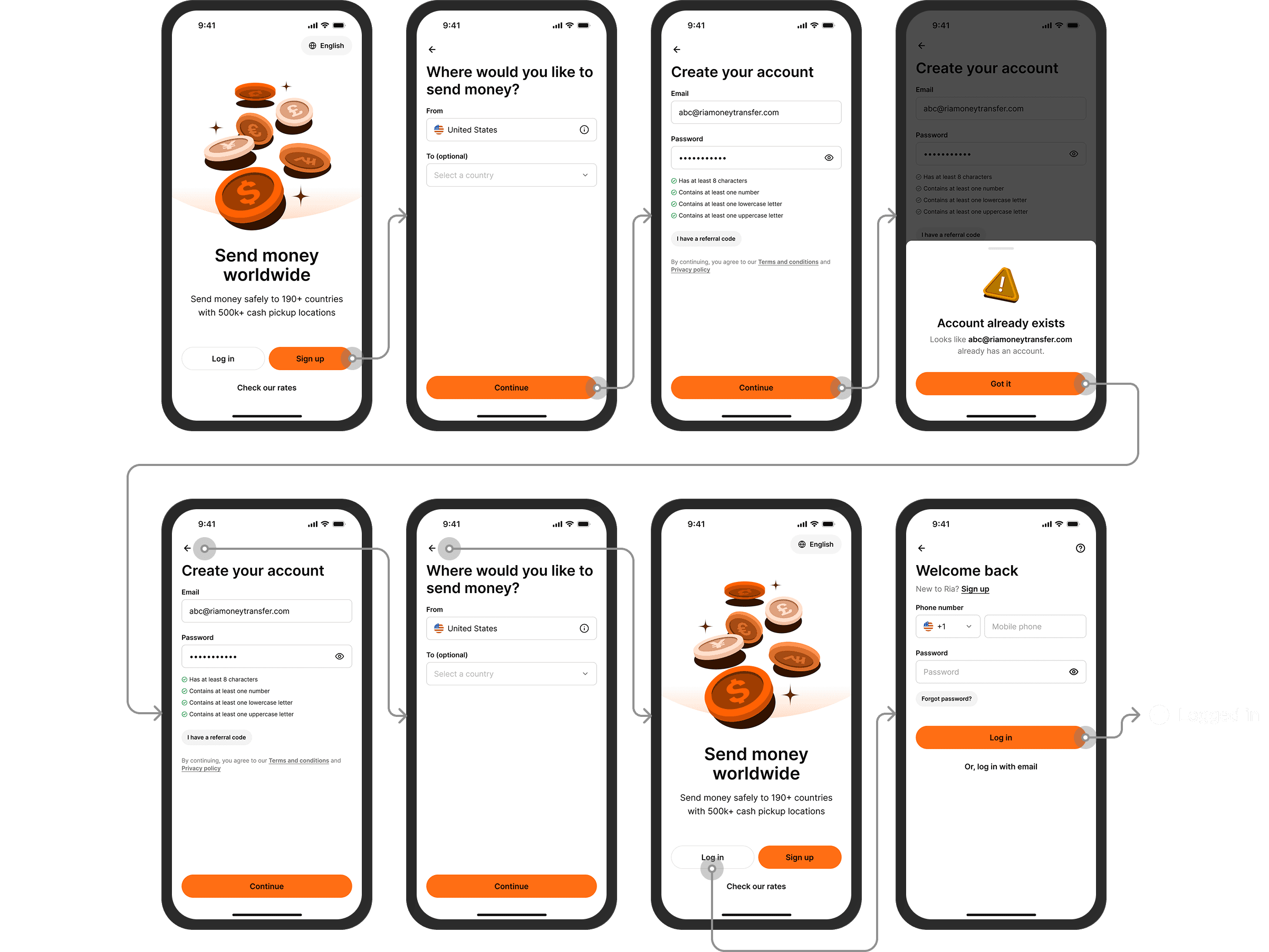
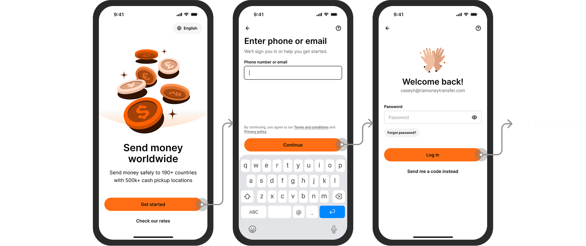
From 8+ steps with recall and recovery to 3 steps without either.
Before
8+ steps, ~120s average, ends in recovery
After
3 steps, seconds to log in
Process highlights
Designing the logic that routes every user
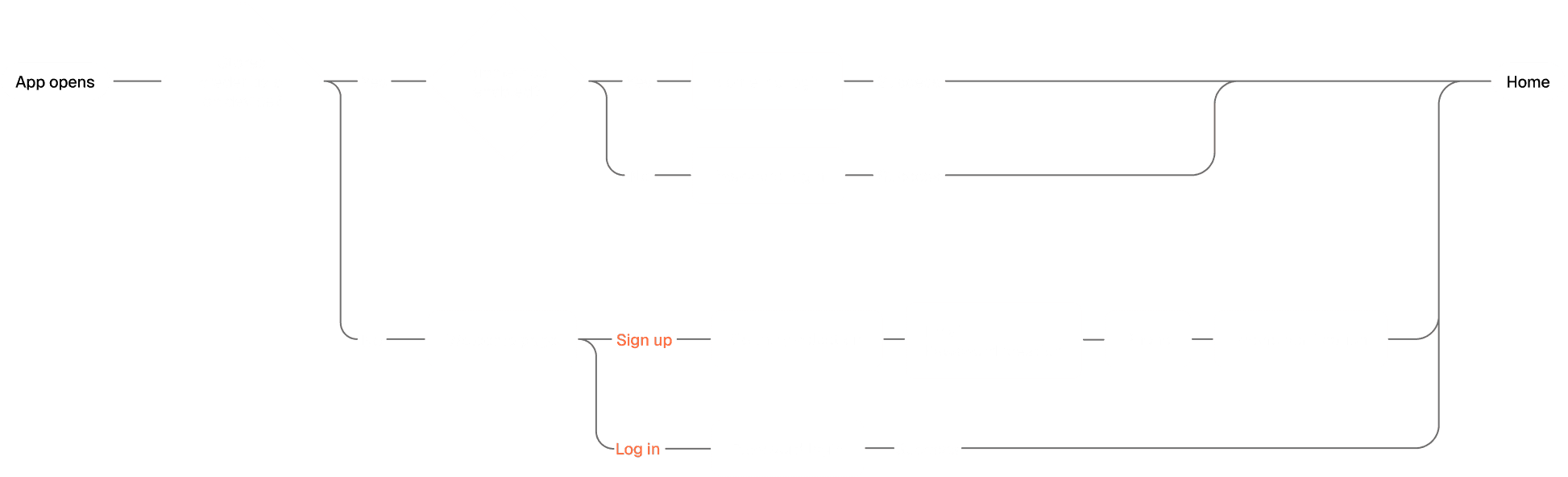
I started by redefining the entire Sign up / Log in flow. I mapped every possible user scenario—including new and returning users, recognized and unrecognized devices, biometrics, and the routing logic between them—to align the direction with PM and Engineering and establish a foundation for prototyping.
Before
After
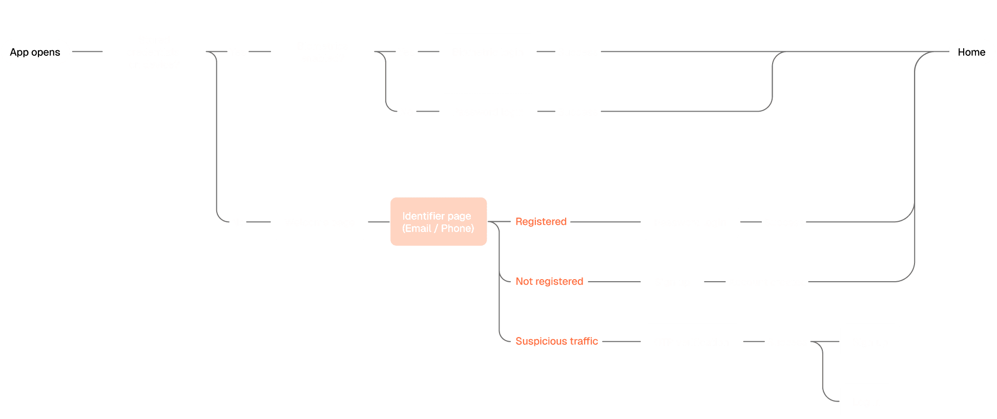
*For readability, only the primary user paths are shown here. The complete flow includes error handling and recovery paths.
Key decision
Supporting both email and phone was worth the added system cost
While mapping the flow, one key question surfaced: should the new entry point accept email, phone, or both?
The initial scope from PM was email-only, since it would lower OTP costs and keep the routing logic simpler. However, after analyzing login data, I found users relied on email and phone almost equally. Restricting the entry point to email would force nearly half of our users to switch from the sign-in method they were already familiar with.
For a product that already requires frequent re-authentication, forcing users to recall the wrong identifier compounds the friction. So I pushed to put the cost on the system: support both identifiers, and let the system route to the corresponding flow based on input type.
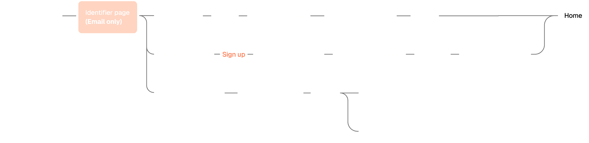
Previous version
Email-only recognition forced phone-login users to recall their signup email.
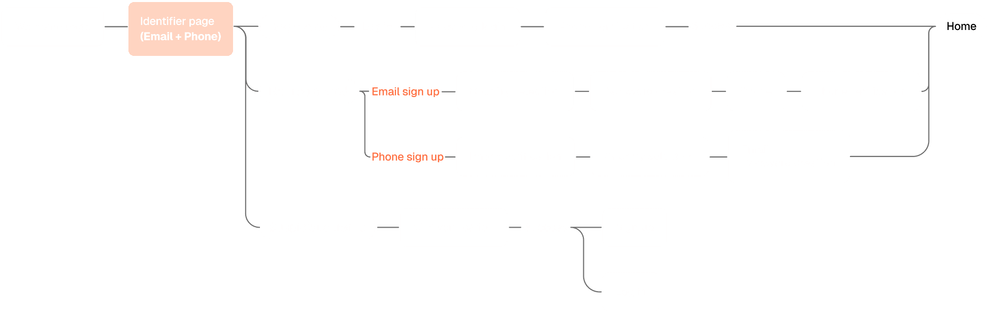
Final version
Email or phone both work for recognition. The system routes users based on the identifier entered.
Prototyping to test the experience in real use
Once the architecture was defined, I built an interactive prototype in Claude Code and conducted internal usability testing to validate whether the overall experience matched users’ mental models and uncover usability issues that only appeared through real interaction.
Learning 01
New users needed a smoother transition into onboarding
When the system identified someone as a new user, the prototype took them directly into account creation.
The flow was logically correct, but the experience felt abrupt. Users went straight from identifying themselves into a long signup flow, without a natural transition into the product. It felt like walking into a store and being asked to fill out a membership form before anyone welcomed you.
To create a smoother progression, I worked with our motion designer to introduce a welcome transition before account creation. The functionality remained exactly the same, but the experience felt much more intentional and welcoming.
Previous version
The system took users straight into a long signup form immediately after identification.
Final version
Introduced a welcome transition before signup, making the experience feel more welcoming.
Learning 02
The new entry point needed clearer communication
Merging Login and Signup meant users no longer needed to decide which path to take.
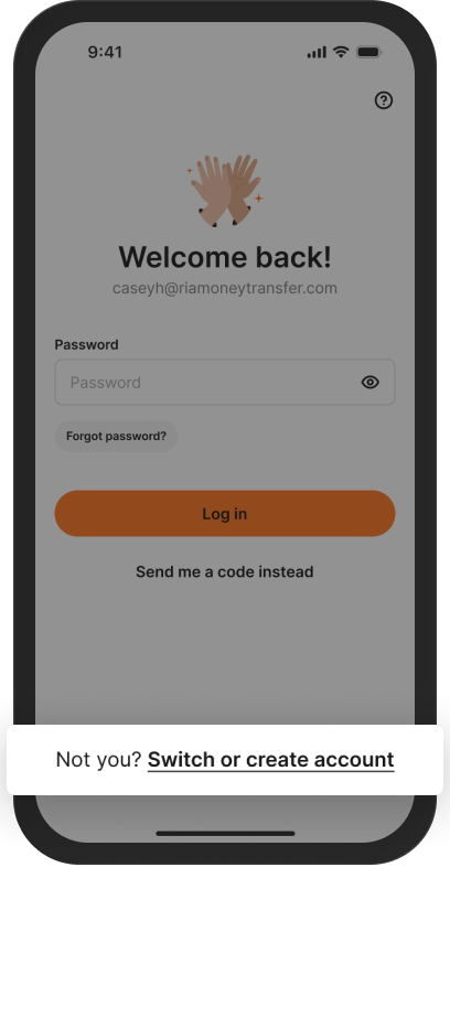
However, usability testing showed that the original UX copy didn’t clearly communicate what to do if users wanted to sign in with a different account or create a new one.
I refined the copy to make the purpose of the entry point more explicit, clearly communicating what would happen after users entered their email or phone number and helping them understand how to accomplish the task they intended.
Previous versions
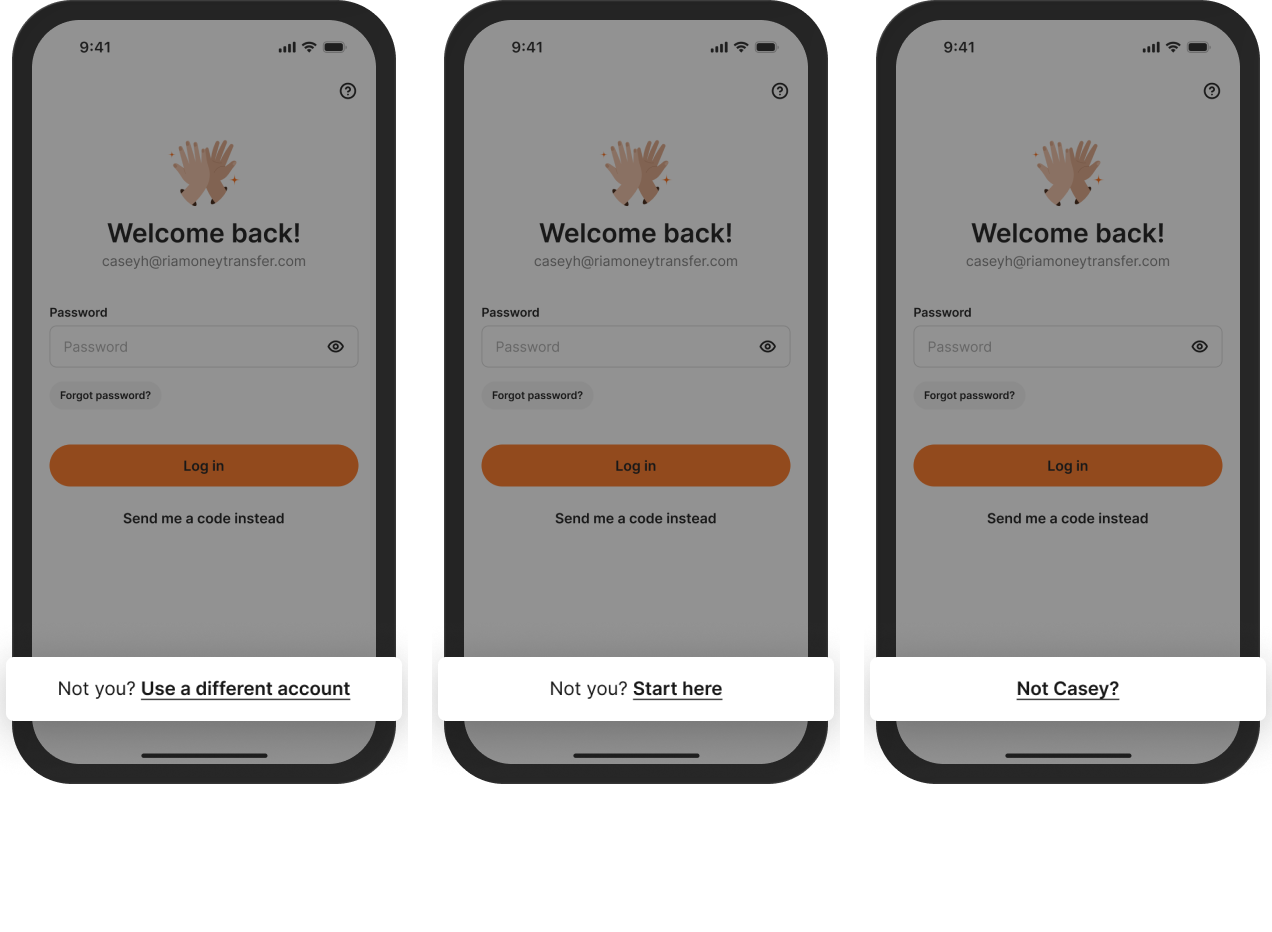

Final version
Results
Rolling out in the U.S. starting June 2026, expanding globally.
Expected impact
~85%
Faster sign-in
Estimated to decrease from ~120s to ~15–20s once returning users no longer hit the registration wall.
69k → 0
Monthly “account already exists” errors
A single entry point means returning users are never asked to choose, so the wrong turn can’t happen.
Beyond the redesign
I initiated Design QA that scaled beyond my team.
Before this project, Ria only had Functional QA. Design intent often got lost by the time features reached production. I introduced a Design QA step alongside Functional QA to close that gap. It started on the Acquisition team, then rolled out to three other teams I work with directly. After I shared the results internally, two more teams adopted it.
I initiated cross-functional design review.
The old workflow ran through the PM. Design intent got lost in the relay, and when questions came back to me secondhand, I lacked the context to decide. I started a shared design review with developers and PMs. Now everyone holds the same context, so we make decisions together. Designs ship more thorough, and projects move faster.
What I learned
Designing for edge cases and recovery matters as much as designing the happy path.
Users rarely follow the happy path we design. What actually blocks them is usually not the main flow, but the exceptions we didn’t design for. This project reminded me that a recovery system is just as valuable as the happy path — the system needs enough resilience to catch edge cases, so users can still complete their task even when they drift off course.
AI helped me ship ideas faster and communicate more precisely across roles.
Using AI to build a high-fidelity prototype changed two things. It surfaced more opportunities to refine interaction details that static screens can’t reveal. And it made cross-role communication sharper — aligning with the team on direction and handing off interaction intent to engineers works far better through a prototype than through words or static frames.
Product thinking becomes the real differentiator for designers in the AI era.
When execution speed is no longer the bottleneck, knowing what to build becomes far more valuable. This project made me realize: once I knew the direction, turning ideas into a prototype happened at a speed I hadn’t experienced before. But that speed only pays off when I know where I’m heading, can judge what’s feasible, and understand what actually meets Ria users’ needs. What sets designers apart from here comes back to the fundamentals: judgment about the product, understanding of the user, and the thinking behind every decision.